The Objective →
TURN DATA INTO INTERACTIVE CHARTS
USING A CREATIVE CODING LANGUAGE, PROCESSING.
TOPIC →
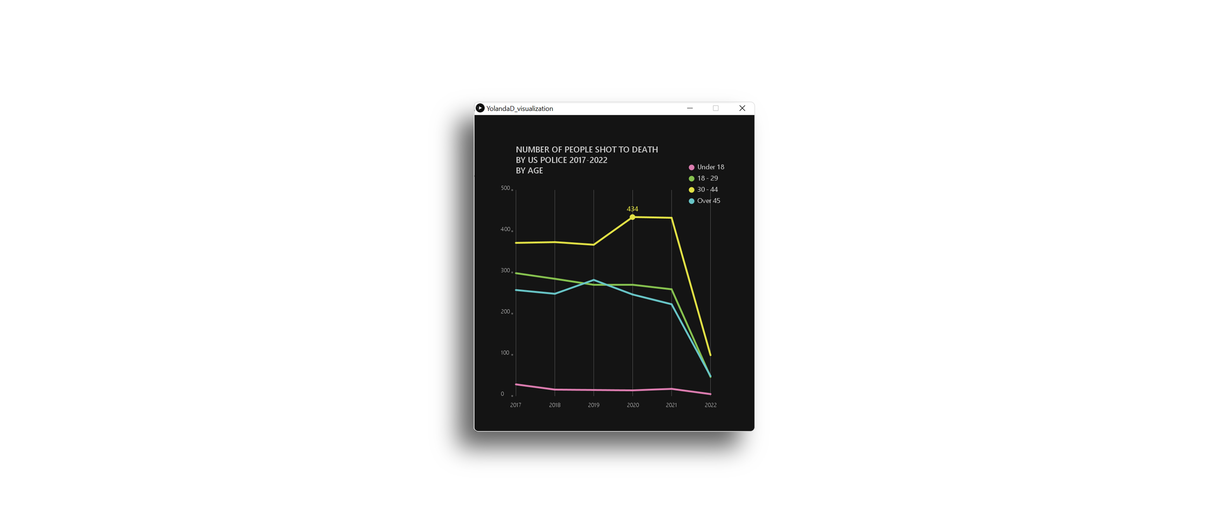
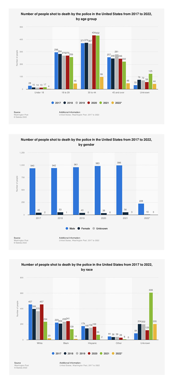
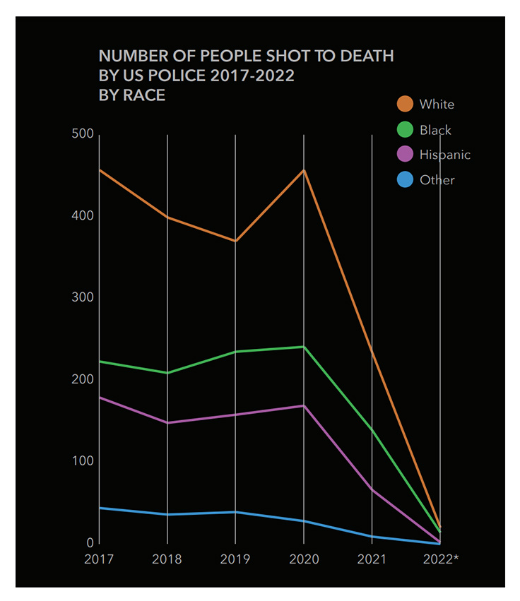
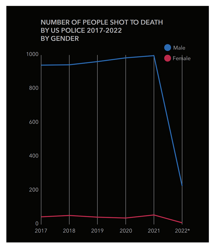
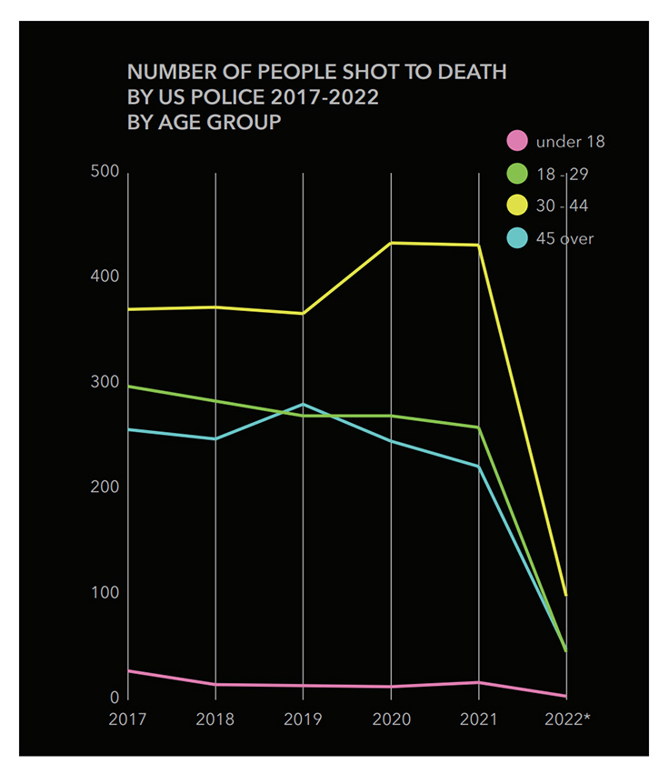
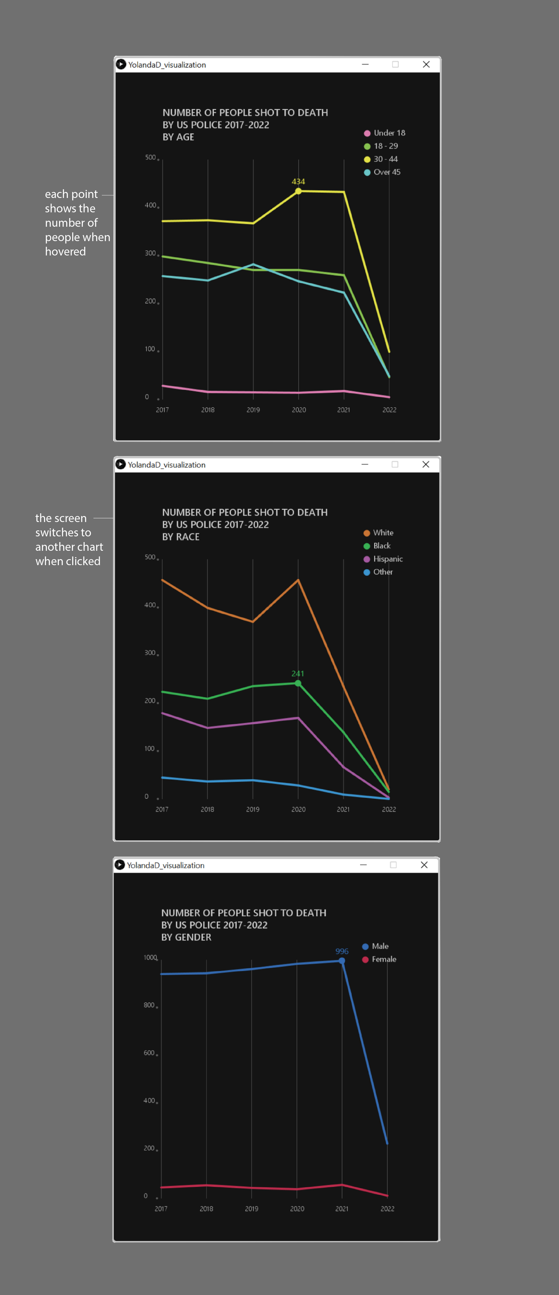
The charts will visualize the number of people that were shot to death
by US Police from 2017 to 2022, which are categorized by
1. gender,
2. race, and
3. age group.
The data used is sourced from Statista.com.
Concept →
Create interactive charts with consistent axis.
Although Statista.com has provided good data visualization through graphs, the data can be improved by adding interactivity. Moreover, this project will visualize the data using consistent x and y axises on charts, so that the information is easier to digest.
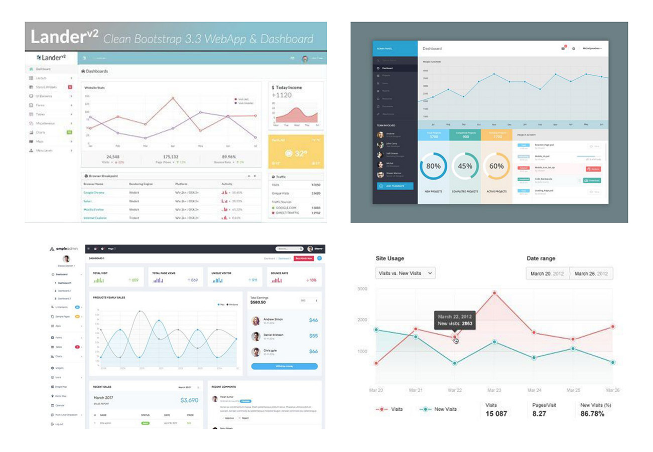
MOODBOARD →
Collect inspirations from the web to help determining the chart type and style.
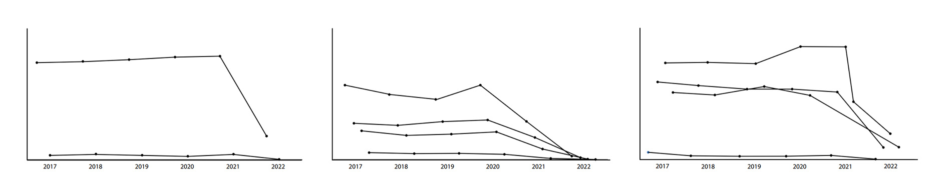
SKETCHES →
CREATE DIGITAL SKETCHES.
COMPOSITION →
CREATE FINAL CHART COMPOSITIONS
BEFORE MOVING INTO PROCESSING.
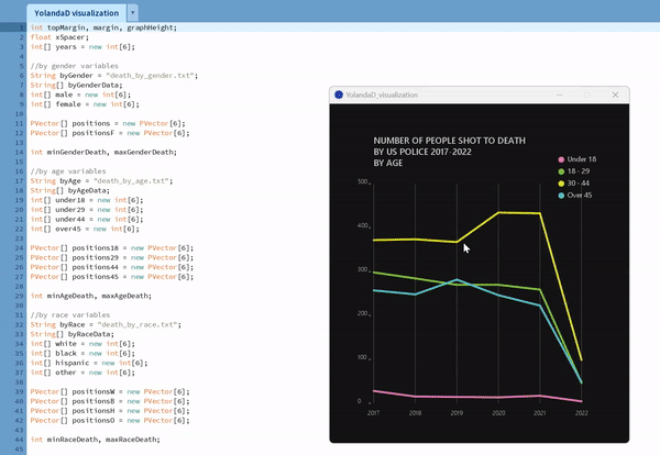
PROCESSING →
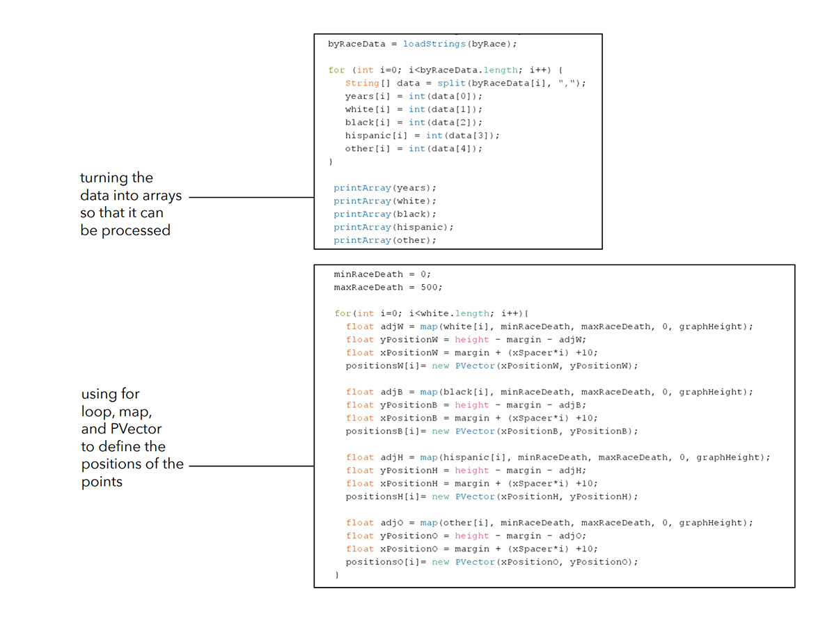
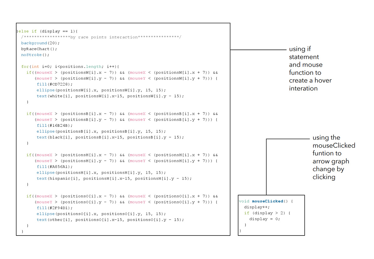
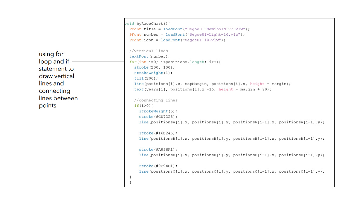
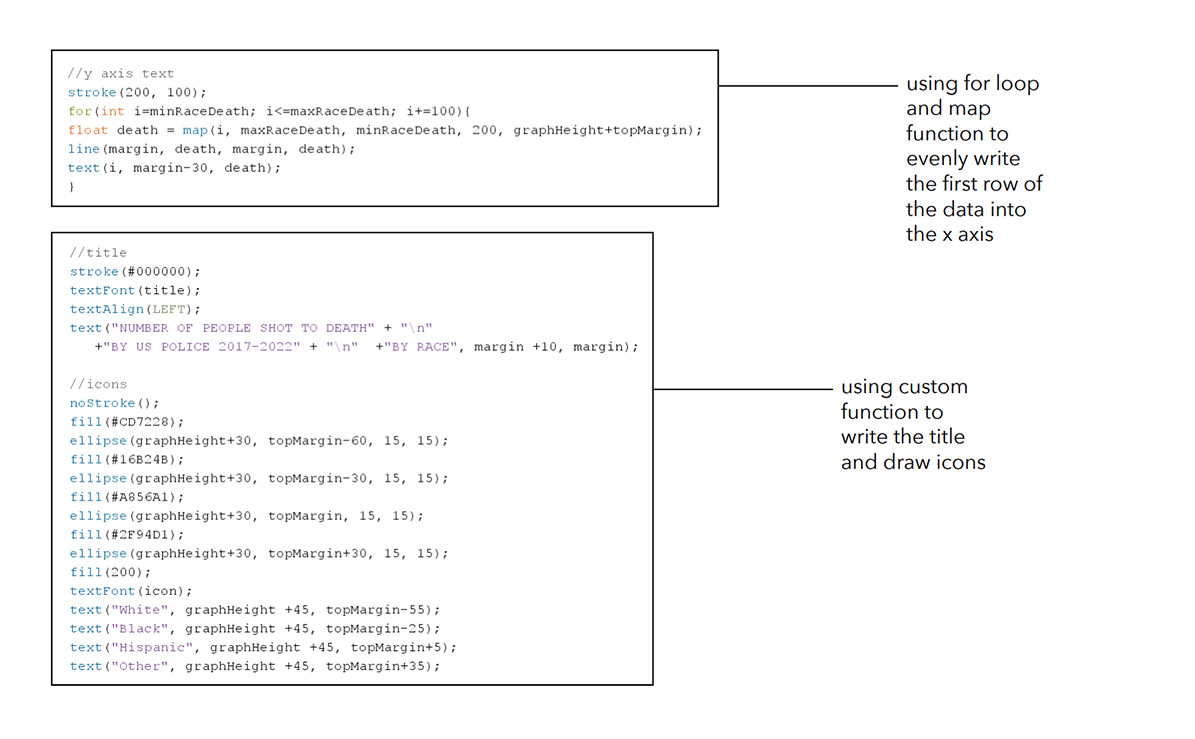
Break down the processing codes and explain what they do.
THE CHARTS →
Repeat the shapes using the for() function to make the pattern.
RESULT →